Welcome, 3D World
Hi there!
Another week ending in New York City. Time flies so fast, that's scary. I've been here for 2 months now. 4 months to go! With the lockdown easing, I wish these months to be more social and rich than the first ones!
I've put Analytics on the blog last week. Big brother is watching you, and told me the average session lasted about 3 minutes. Thank you for that! I thought about adding a newsletter, and added it actually, but I've backed off when I saw, that due to US laws I had to display my physical address on every newsletter I send.
Beside some professional projects that started last week, I spent most of my evenings on Blender, doing 3D modeling. My friend's portfolio is progressing well.
He's been working hard on physic algorithms while I was imagining, modeling and texturing the scene.
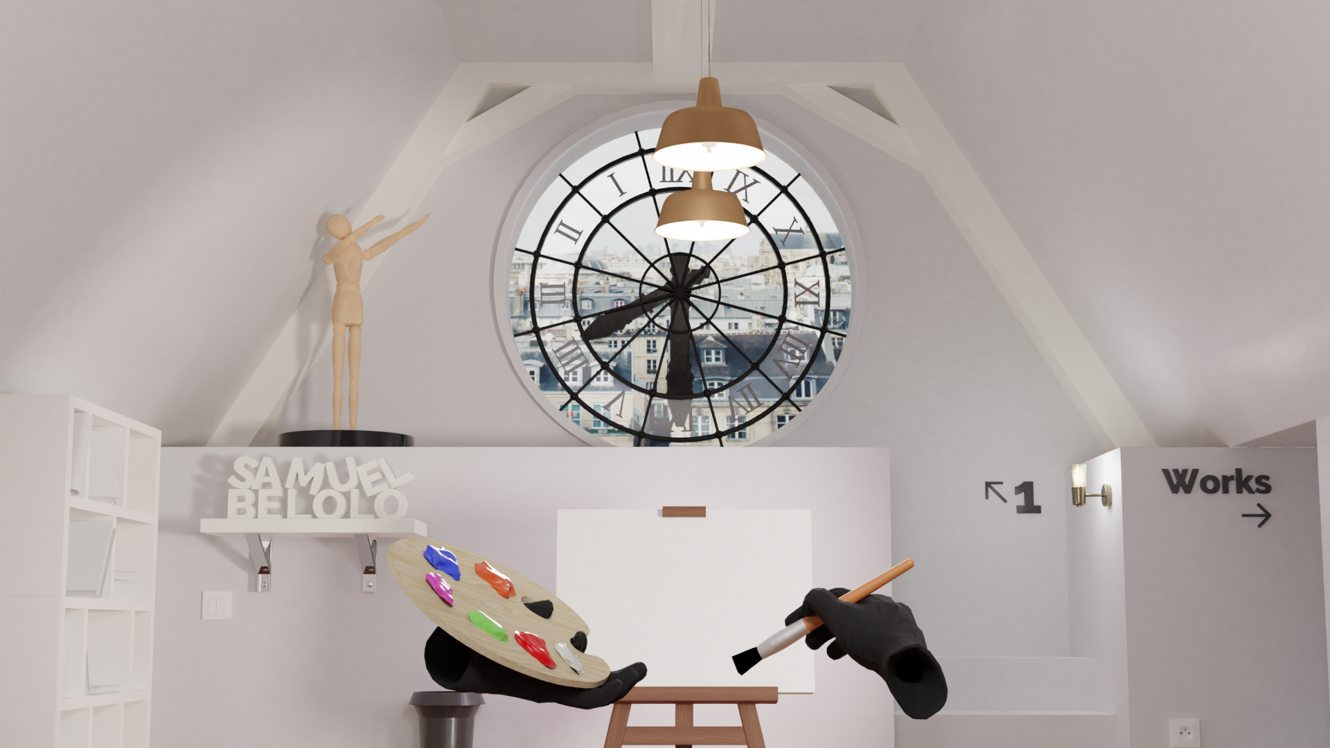
It was a good start. I mean, it's the fakest window I've ever seen, and the hands look like butcher's hands, but it was a good start. My next focus was to do something with these hands. We wanted the user to interact with the scene through classy gloves. I'm not gonna lie, I'm not a good modeler. I can create an easel, a bookshelf, that kind of thing, but modeling hands is way more difficult. I firstly tried to create gloves for these hands. The result wasn't that bad, but I didn't manage to create realistic textures. I put my ego aside and searched on Google for textured gloves, and... Ta-da!
The gloves came with arms and forearms I didn't need. I deleted them, separate the two hands to be able to control them independently, animated their articulations to make them hold the palette and the paintbrush, and that was it! (Don't take that sentence out of context. It could get me in trouble, I only dissect 3D cubes, I promise).
The next mission was to improve this window. I started by trying to add some realism to this old window. But how are you suppose to brighten an entire scene with a cute but tiny window? You can't. These late night thoughts brought me 3h later to this.
Out of nowhere, the idea of having the Musée d'Orsay clock as a window seemed like the most logical one. It would add a lot of cachet to our scene, for sure! There was still an issue tho: the easel was totally obstructing it. I decided to add a mezzanine and to increase walls height. From a student room to a duplex next to the Eiffel Tower in 3 cube dissections!
The lighting was still a disaster. It was my first time trying to use images as light emission source. A few Reddit posts and shaders later, I managed to have a pretty convincing scene lighting. The image act as an emission source and has been powered up a lot while being normally brightened for the camera, thanks to the shader. Add a few lamps inside, and it makes the trick!
With all these new elements, the scene started to become kind of stuffy. It was time to break some walls! We decided to replace the construction ladder by stairs. Easier to climb when you get home drunk at 5AM. I didn't think of it at first, but making good stairs is a puzzle. I won't get you through all the steps, but during the process I got the mezzanine lowered and the stairs resized a few times.
I can now proudly say that I'm a cube designer. Joke aside, there's still a lot of way to go, but the MVP isn't that far now. I'll take a break from the project for a few days. I don't want to burn my creativity.
See you in the next one!